

The Complete Mobile App Design Process (2026): From Idea to App Store Launch
A practical, end-to-end guide to the mobile app design process — idea validation, research, wireframing, prototyping, UI, design systems, testing, handoff, and launch — written for founders and product teams.
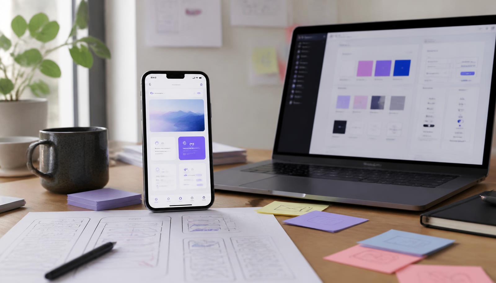
Key takeaways
- The mobile app design process has four phases: discover (validation and research), define (IA, flows, wireframes), design (UI, prototypes, design system), and deliver (testing, handoff, QA, beta, launch).
- Validation comes before visuals. Most expensive redesigns are caused by skipping problem validation, not by weak UI.
- Five to eight users per usability test round surfaces the large majority of serious issues — you do not need a big research budget.
- A design system is what keeps design and engineering costs flat as the app grows; without one, every new screen re-litigates old decisions.
- Launch is a checkpoint, not the finish line. The strongest apps treat post-launch UX iteration as a permanent part of the roadmap.
- Typical range: 6–14 weeks of design for a focused v1, with cost driven by screen count, platform count, and how much research is genuinely new.
Quick Answer: What Is the Mobile App Design Process?
The mobile app design process is a repeatable sequence — validate, research, define, design, test, launch, improve — that turns an idea into a product people can use without instructions.
It runs in four phases. Discover validates the problem and studies users. Define turns findings into information architecture, flows, and wireframes. Design produces prototypes, UI, and a design system. Deliver covers usability testing, handoff, QA, launch, and iteration.
The order matters more than the tools. Teams that jump straight to screens usually pay for it later in redesigns, support tickets, and churn.
Step 1: Validate the Idea Before You Design Anything
Validation proves that a real, frequent, painful problem exists before a single screen is designed.
Talk to 8–12 people in your target market and ask what they do today, what it costs them, and what they have already tried. If nobody has attempted a workaround, the problem is probably not urgent.
Look for evidence, not enthusiasm: existing spend, manual spreadsheets, or repeated complaints. Write down the one job your app must do brilliantly — everything downstream depends on that sentence.
Step 2: Research the Market and the User
Market research tells you what the category already teaches users. Install the three closest competitors, complete their onboarding, and note where they lose you. Those gaps are your opportunity.
User research tells you how people actually behave, which is rarely how they say they behave. Short interviews and a few observed sessions are usually enough for a version one.
- Interview 8–12 target users, not friends
- Audit 3 competitors end to end, including cancellation
- Record real quotes — they become your copy later
- Note the workaround people use today
Step 3: Define Structure — IA and User Flows
Information architecture decides where everything lives; user flows decide how someone gets from intent to outcome.
Group features by user goal, not by internal team. Most navigation problems are structure problems wearing a UI costume.
Then map the three or four flows that matter most: sign-up, the core action, and payment or completion. Design the path before the page and you avoid dead ends, unclear back behaviour, and missing states.
Step 4: Wireframe — The Cheapest Place to Be Wrong
Wireframes settle layout, hierarchy, and content order without the distraction of colour. Changing a wireframe costs minutes; changing a built screen costs days.
Wireframe the unglamorous states too: empty, loading, error, offline, and success. These are where real apps break, and they are always skipped when a team designs from a mental picture.
Step 5: Prototype and Test With Real People
An interactive prototype lets you test the product before engineering writes any code.
Link your key screens into a clickable flow and give five to eight people a real task without instructions. Watch where they hesitate, tap the wrong thing, or ask a question.
Run small rounds repeatedly rather than one big study at the end. Each round tests a version that already absorbed the previous round's fixes, which compounds quality fast.
Step 6: UI Design and the Design System
UI makes the structure legible: type scale, spacing, colour, iconography, and motion. Clarity comes first, personality second.
A design system — tokens plus reusable components — is what keeps costs flat as the app grows. Without one, every new screen re-argues spacing and button behaviour, and engineering rebuilds the same patterns repeatedly.
- Use a consistent spacing and type scale
- Design components, not one-off screens
- Respect iOS and Android platform conventions
- Document states: default, pressed, disabled, error
Step 7: Accessibility Is a Business Requirement
Accessible design widens your paying market and reduces support load. It is also far cheaper to build in than to retrofit.
Aim for 4.5:1 text contrast, 44px minimum tap targets, labels on every control, support for larger system text, and no meaning carried by colour alone. Test one flow with a screen reader before launch.
Step 8: Handoff, QA, and Launch
Handoff and design QA are where good design usually leaks out of a project.
Give engineering tokens, components, states, and edge cases — not just screens. Then run a separate design QA pass on the built app to catch spacing, motion, and state drift.
Before submission, check store metadata, demo credentials, privacy disclosures, working support links, and a crash-free build. Most rejections are process failures, not design failures.
Step 9: What Happens After Launch
Launch starts the learning phase. Track activation, retention, funnel drop-off, crash rate, store reviews, and support themes.
Then run a simple loop: observe, form one hypothesis, ship a small change, measure. Apps that improve monthly outperform apps that wait for an annual redesign, because each fix compounds on real usage data.
Cost and Timeline at a Glance
A focused v1 typically takes 6–14 weeks of design and $6,000–$40,000, depending on screen count, user roles, platforms, and how much research is genuinely new.
The fastest way to reduce both numbers is to cut scope, not stages. Ship a smaller product that does one job well, then expand once real users tell you where the value is.
Final Thoughts
Great apps are not the output of one inspired designer. They come from a sequence: understand the problem, structure the solution, design it clearly, test it honestly, and keep improving after launch.
You can compress that sequence when budgets are tight, but skipping steps only moves the cost later — into redesigns, support, and churn. At Pixel2Tech this framework sits behind every mobile product we work on.
Frequently Asked Questions
What is the mobile app design process?
It is the structured sequence that turns an idea into a launched app: validate the problem, research users, define information architecture and flows, wireframe, prototype, design the UI and design system, test usability, hand off to engineering, launch, and keep improving.
How long does it take to design a mobile app?
A focused version one usually needs 6 to 14 weeks of design: 1–3 weeks discovery, 2–4 weeks architecture and wireframes, 3–6 weeks UI and design system, 1–2 weeks testing and handoff. Multiple roles or platforms extend that.
How much does mobile app design cost?
Design-only budgets commonly run from roughly $6,000 to $40,000. The driver is not visual polish — it is the number of screens, states, user roles, and edge cases the app must handle.
What is the difference between UI and UX in app design?
UX is structure and behaviour: what problem the app solves and how users reach an outcome. UI is the visible layer: type, colour, spacing, components, motion. Strong UI on weak UX still gets uninstalled.
How many users should I test with?
Five to eight participants per round of moderated testing catches most serious issues. Several small rounds during the project beat one large round at the end.
Your App Deserves More Than Great Design. It Deserves Real Business Results.
A successful mobile app is built on strategy, user research, thoughtful design, and continuous improvement. At Pixel2Tech, we help startups and businesses transform ideas into intuitive, high-performing mobile experiences that users enjoy and businesses can scale with.
Explore related Pixel2Tech services
Related Articles
More reading on AI, automation, and building better business systems.

Design Systems for Small Teams: How to Build Better Products Faster
A design system isn't only for large companies. Here's how small teams build simple, practical systems that improve consistency, speed, and product quality.

Why Every Business Needs a Modern Website in 2026
A 10-point audit to figure out if your website is helping or hurting.

Headless Shopify: A Practical Guide for Founders and eCommerce Brands
What headless Shopify actually means, when it is worth the cost, when a well-built theme wins, and how to plan the move without breaking revenue.

Your Business Doesn't Need More Software. It Needs Better Systems.
Most businesses don't have a technology problem—they have a systems problem. Adding another tool rarely fixes friction; sometimes it makes it worse. Here is how to build connected systems that actually scale.